Color Theory for Cake Design: The Wheel Is Not the Point
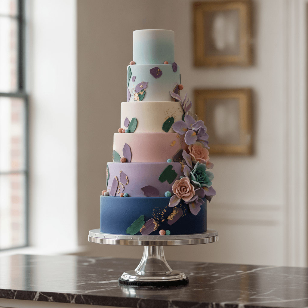
Cake-design color advice online is mostly the art-class color wheel (complementary! analogous! triadic!) — which is true and almost useless, because the difference between a $200 cake and a $900 cake is rarely hue-harmony; it's *restraint* — how many colors, how saturated, and how much breathing room the design has. Here's the color theory that actually moves cakes from homemade-looking to professional.
Rule 1: The 60-30-10 Split (The Architecture)
Interior design's rule that transfers directly: 60% dominant color (usually the base — the buttercream field), 30% secondary color (the main decoration hue — drips, bands, main flowers), 10% accent (the pop — the berries, the gold leaf, the tiny detail). A cake with 60/30/10 always reads 'intentional.' The failure mode is the even split — three colors at 33% each compete instead of layering. The easiest single upgrade for home cake-decorating: establish a dominant (usually a neutral or pale base) and let the decoration be clearly *secondary*. The dominance IS the design.
Rule 2: Saturation Discipline (What 'Elegant' Actually Is)
Pick up any two cakes — one that reads elegant and one that reads kids'-party — and the difference is usually not the skill, it's the saturation. Elegant cakes live in desaturated color: dusty pink not hot pink, sage not Kelly green, dusty blue not royal. The mechanics: any gel color can be muted by (a) less of it, (b) a dot of its complement (blue + the tiniest orange = dusty blue; this is why the color-mixing guide matters for frosting as much as canvas), or (c) a dot of brown/ivory food color (the 'vintage' mute). The saturation dial is the single most powerful style control in frosting — more than piping skill.
Rule 3: White Space (The Negative-Space Rule)
The O'Keeffe principle from our art-palettes post: the unfrosted-looking restraint is the luxury signal. Professional cakes leave 30–50% of the surface *quiet* — smooth field, unadorned tier faces, breathing room around the decoration clusters. The home-baker instinct is to fill the whole surface (you paid for the piping practice, the whole cake should show it). Resist. Decorate the top-third or one quadrant-cluster, and let the rest be the field. The cake reads as composed rather than covered. When in doubt, decorate less and move the decoration off-center — asymmetry plus empty space is the modern cake-design default.
Rule 4: The Palette Source (Steal Well)
Don't invent palettes from the wheel — source them:
- The wedding palette (if it's a wedding cake — coordinate, don't improvise; the florist's palette is the free design document)
- A painting (per the artist-palettes post — pre-tested harmony)
- A photo of the season (an October foliage photo's palette IS the fall cake palette — the eyedropper trick works here)
- The bakery box / Pinterest, but filtered: 'elegant cake' + your season — copy the saturation level specifically, not just the hues
The source discipline answers 'how many colors' automatically: sourced palettes come with proportion baked in.
Rule 5: The Metallic Exception (When to Go Bold)
The one place saturation and boldness work in elegant design: metallics and structural elements. Gold leaf, gold drip, gold dust — the metallic accent can be intense because it isn't a color in the palette sense, it's a texture. A 60/30/10 cake can handle a gold element beyond the 10% because gold reads as 'material' not 'hue.' Same with fresh flowers: the flowers' colors are allowed to be saturated because they're natural objects, exempt from the frosting-saturation rules. This exemption logic — color restraint applies to the *frosting field*, not to natural/material elements — is the rule that lets elegant cakes still have visual excitement. Gold drip on a muted cake is the cheat code.
The Fast Diagnostic (For Your Own Design)
Before decorating, look at the planned design and ask:
- What's the 60%? (There must be an answer.)
- Which color is the LOUDEST? (If it's the frosting base — reconsider; if it's an accent — good.)
- What fraction of the surface is quiet? (Under a third = plan to remove something.)
- Where did this palette come from? (If 'my head' — consider sourcing it.)
- Does anything shiny or natural exist in the design? (If not, consider the metallic/real-flower exemption — it's free elegance.)
Five questions, 30 seconds, catches 90% of the design problems that people otherwise discover at the party. Or bring the whole question to us — the cake consult is exactly this diagnostic conversation, with buttercream at the end.
Restraint, saturation, sourced palettes, white space — that's the actual color theory of expensive-looking cakes. Bring your palette to a consultation; we'll design it with you.