How Color Theory Makes You a Better Cake Decorator (Even If You're a Beginner)
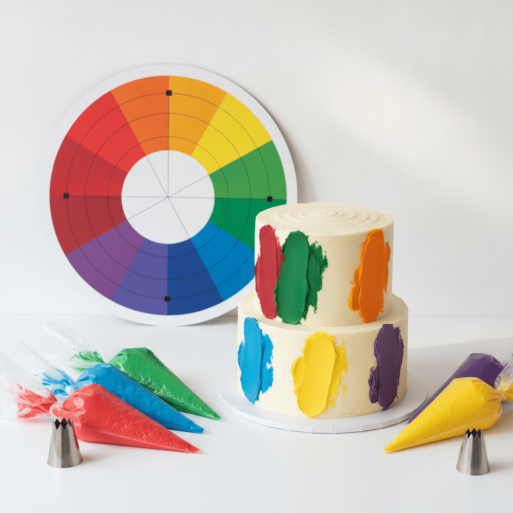
The difference between a cake that looks homemade and one that looks like it came from a design studio usually isn't piping skill — it's color choice. Bakers who understand even basic color theory make better decisions with the same bag of tips. Here's the working knowledge that changes everything, translated from art school into cake terms.
The Color Wheel Is a Tool, Not a Poster
Every cake palette starts with a relationship on the wheel. Complementary colors sit opposite each other — orange and blue, purple and yellow — and they produce the most visual energy. That's why a pale blue cake with burnt-orange florals pops in photos. Analogous colors sit next to each other — blush pink, coral, peach — and create calm, harmonious designs. Analogous palettes are forgiving; complementary ones are striking. Choose your mood first, then your colors.
The 60-30-10 Rule Keeps Cakes From Looking Busy
Interior designers use this ratio and it maps perfectly to cake design: 60% dominant color (your base buttercream), 30% secondary (drips, larger florals, textured panels), 10% accent (small piping details, gold leaf, berries). Where amateur cakes go wrong is 40-40-20 — every color fights for attention, and the eye doesn't know where to land. Next time you plan a design, assign percentages before you mix a single batch of color.
Saturation Matters More Than Hue
Baby pink and hot pink are the same hue at wildly different saturations. Fully saturated buttercream in three or four hues reads as a child's birthday party (which is sometimes exactly right!). Desaturating — adding a tiny touch of the color's complement or a drop of brown/black — gives you the muted, dusty tones that read as elegant. Desaturated sage, dusty rose, and slate blue are the workhorses of wedding cake design for this reason. Pro tip: gel colors deepen as they sit, so color your buttercream 80% of the way and check it again in an hour.
How Lighting Lies to You
Buttercream looks different under your kitchen's warm LED bulbs than it does at an outdoor afternoon reception. If the cake is for an evening event with candlelight, colors will skew warmer — your pale peach may read almost colorless, so go one shade deeper. For photography, cool daylight-balanced palettes (blues, lavenders, crisp whites) photograph more accurately than very warm palettes, which can turn muddy on phone cameras.
A Practice Exercise You Can Do This Weekend
Buy six plain cupcakes, white frosting, and one set of gel colors. Frost them with: (1) a complementary pair, (2) an analogous trio, (3) a monochrome set — one hue at three different saturations. Photograph them side by side. You'll immediately see which combinations you'd want on a full cake, and this exercise costs about $8 and 45 minutes.
Borrowing Palettes From the Pros
When in doubt, steal from great paintings. Monet's water lilies give you sage, periwinkle, blush, and cream. Van Gogh's sunflowers give you ochre, sky blue, warm white, and a whisper of green. Screenshots of nature photography work too — a Hudson Valley fall hillside is a ready-made analogous palette of rust, gold, olive, and bark brown. Nature never clashes; it's a cheat code.
Want to see color theory in buttercream? Browse our custom cake gallery — every design starts with a palette conversation, and we'll happily nerd out with you about saturation.